BRAND IDENTITY / BRAND EXPRESSION SYSTEM / BRAND STATIONERY DESIGN / BRAND SIGNAGE DESIGN
Data analytics company branding case study of a USA based startup
CX Data Labs, headquartered in Texas, USA, was established to offer a holistic approach to data technology and analytics. With a mission to advance the craft, the company specializes in delivering tailored strategy and execution services. Its principals, former decision-makers at Fortune 50 companies, bring a unique vantage point to guiding customer experience, data, analytics, and technology modernization journeys. Grounded in a client-first philosophy, CX Data Labs leverages its diverse expertise to create solutions that integrate seamlessly into organizations. Founder Ranjith Raghunath engaged Suruchi Trivedi to craft a distinctive, minimalist brand identity that reflects this vision.
Brand archetype
The magician: CX Data Labs
The Magician strives to make dreams come true. They can take people on a journey of transformation through the experience of a magical moment. They believe that we are limited only by imagination and defy the common belief of the laws of reality to lead us to a better future. Magicians have a thirst for knowledge and they use it to show their vision. They're the kind of people who promote the advancement of the world, thanks to their knowledge and ability to advise and guide others.
Brand Look: Modern / Minimal / Confident
Brand Feel: Reliable / Best in the segment / Young / Problem Solver / Intelligent / Serious

Brand identity design
The logo was designed to outstand and break through the clutter in the technology market. The unique construction of the perfectly aligned isometric 3D view of “CX” gives it an extra edge, reflecting a forward-thinking approach that is well illustrated in this analytics tech company branding case study of a USA based startup. The distinctiveness of the brand name “CX Data Labs” lies in its emphasis on “CX” (customer experience), and hence the logo icon was crafted to depict “CX” in the most iconic and intellectual way.
Using a sophisticated 3D style not only adds visual depth but also communicates that we are always one step ahead, diving deep into analytics to discover and solve complex business problems. The custom-designed brand icon is a unique mark that seamlessly merges art with strategy. By keeping the identity design clean and minimal, the overall presentation brings to life feelings of trust, professionalism, and positivity—qualities that align perfectly with our magician archetype, inspiring innovation and transformative insights.
The logo catches immediate attention and the isometric lines make the eye move around the icon. The logo is comfortably visible even in the smallest sizes and looks good even in the bigger size. The clean minimal style makes the logo perfect for printing / screens / engraving etc. The uniqueness of the logo makes it highly memorable, building an instant recall for the brand.

Graphic family: Geometric (Data Graphs & Visualizations)
Look: Technical / Minimal / Bold
Feel: Trustworthy / Knowledgeable
Brand typography family
Choosing the right font that reflects the technology brand is essential for communicating the correct message to customers. Typography is the major element in a design that speaks to customers. The typography system was recommended keeping in mind the professional and minimal feel that the brand wants to evoke.

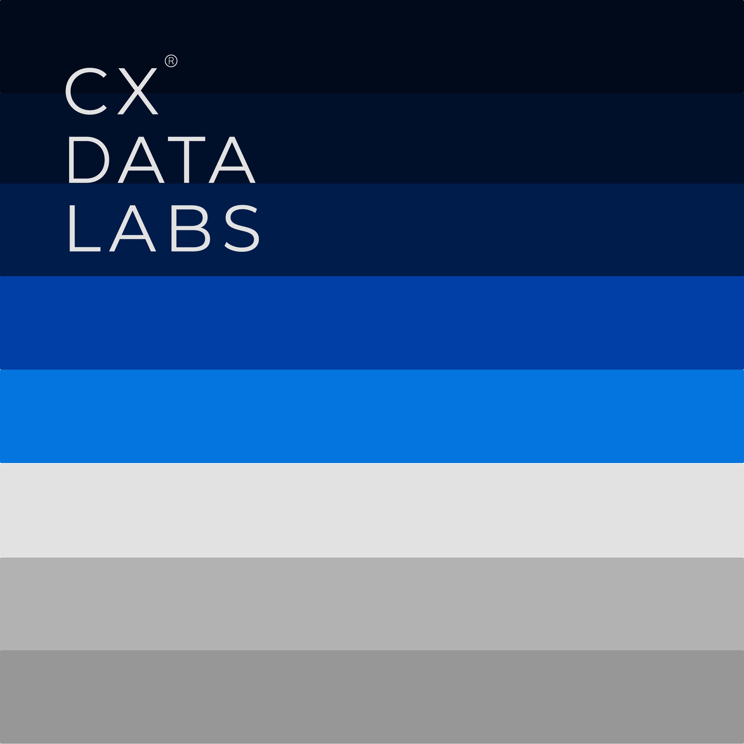
Brand color palette
Crafting a compelling brand identity begins with defining a visual language that resonates with the audience at a deep emotional level. Our strategic approach to the color palette was rooted in extensive research and creative exploration, aiming to evoke the “technological” and “knowledgeable” facets of the brand while reflecting its unique personality. From the outset of this design journey, our goal was to select hues that not only inspire confidence and professionalism but also serve as building blocks for innovative communication.
Throughout our process, we discovered that precise color choices can significantly influence consumer perception—shaping the way a brand is experienced and remembered. This insight is clearly demonstrated in this analytics tech company branding case study of a USA based startup, where thoughtful color integration was pivotal to enhancing trust and conveying technological expertise. Building on these proven principles, we crafted a color strategy that brings depth and sophistication to every interaction.
Royal Blues: Royal blue was deliberately chosen for its strong associations with dependability, loyalty, and logical precision. This deep hue provides a soothing yet commanding presence, evoking feelings of stability and focus. It sets the stage for a brand narrative anchored in reliability and forward-thinking innovation, while also enhancing personal productivity through its calming influence.
Bright Blues: Bright blue introduces a sense of dynamism and expansiveness, inspired by both the limitless sky and the vast ocean. It symbolizes freedom, intuition, and boundless creative potential. In this vibrant shade, the brand communicates openness, trust, and forward momentum—attributes essential for resonating with a modern, tech-savvy audience.
Greys: Grey acts as a balancing force within the palette, representing neutrality and equilibrium. Positioned between the contrasting tones of white and black, grey provides a refined backdrop that underscores clarity and functionality. This balanced hue ensures the overall visual identity remains cohesive, sophisticated, and practical.
Together, these carefully selected colors form a dynamic visual identity, reflecting the brand's ethos of innovation, expertise, and a commitment to continual improvement. The synergy between royal blue, bright blue, and grey not only enhances the aesthetic appeal but also reinforces the brand’s strategic position in a competitive landscape—delivering a message of trust, intelligence, and modernity across all touchpoints.
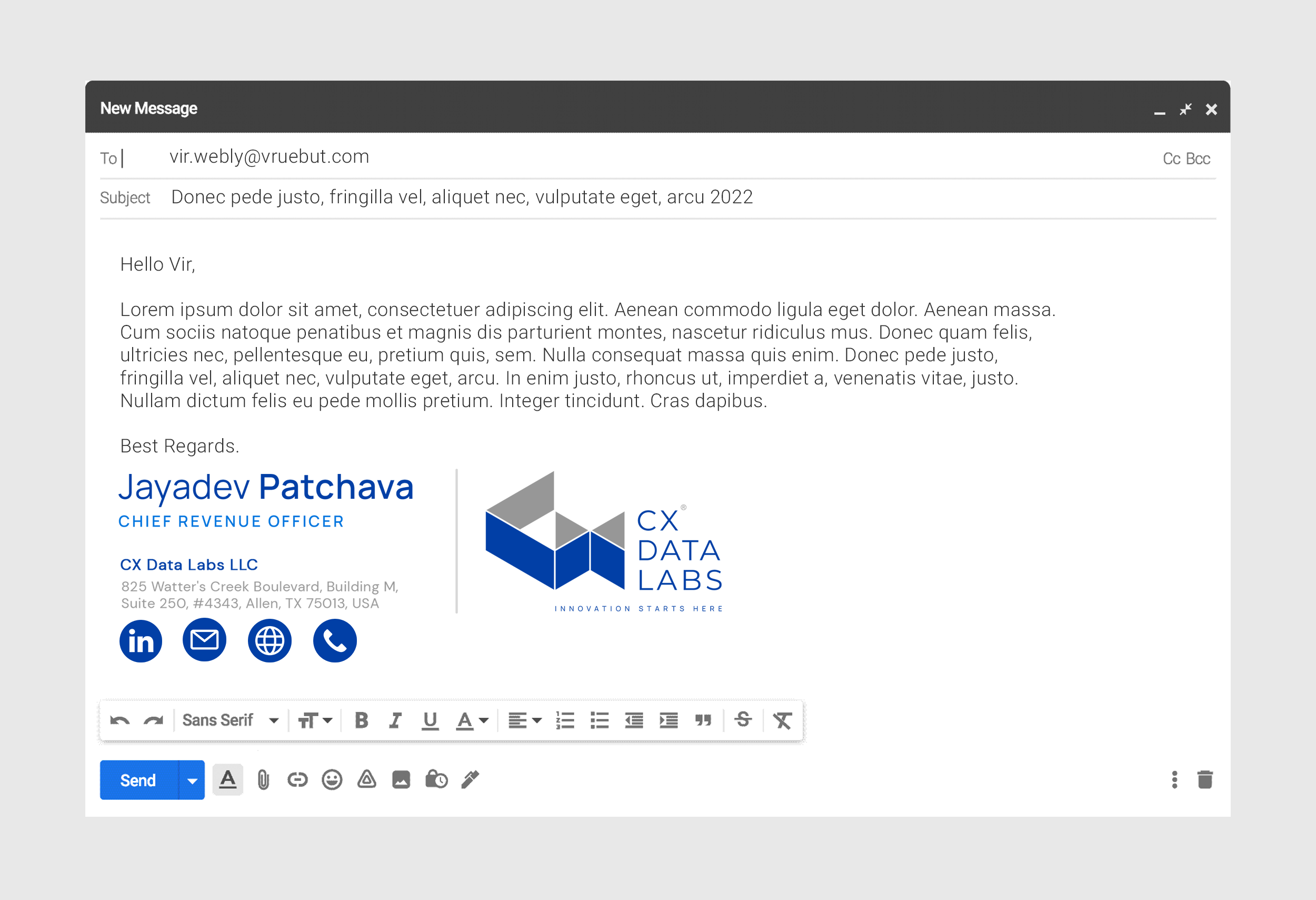
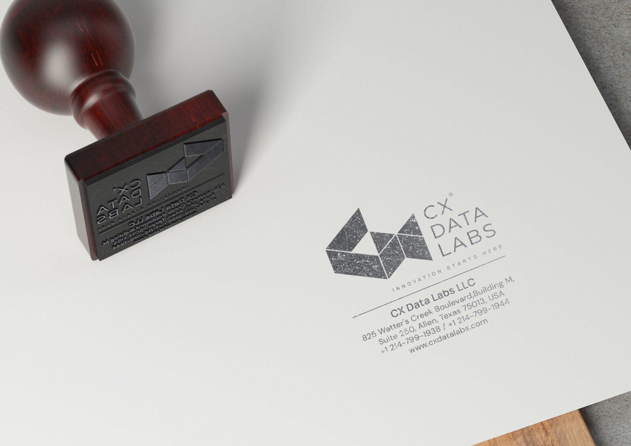
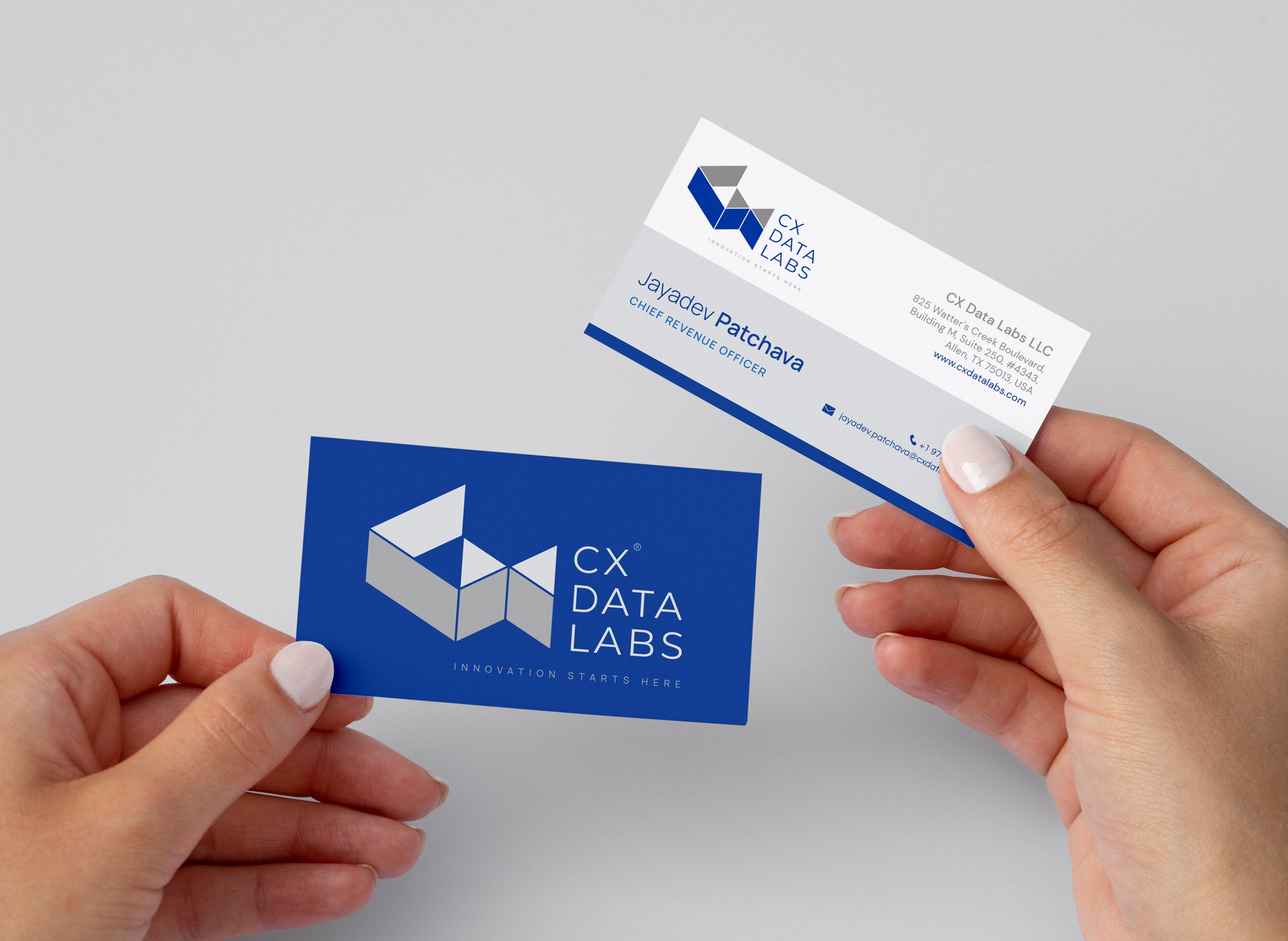
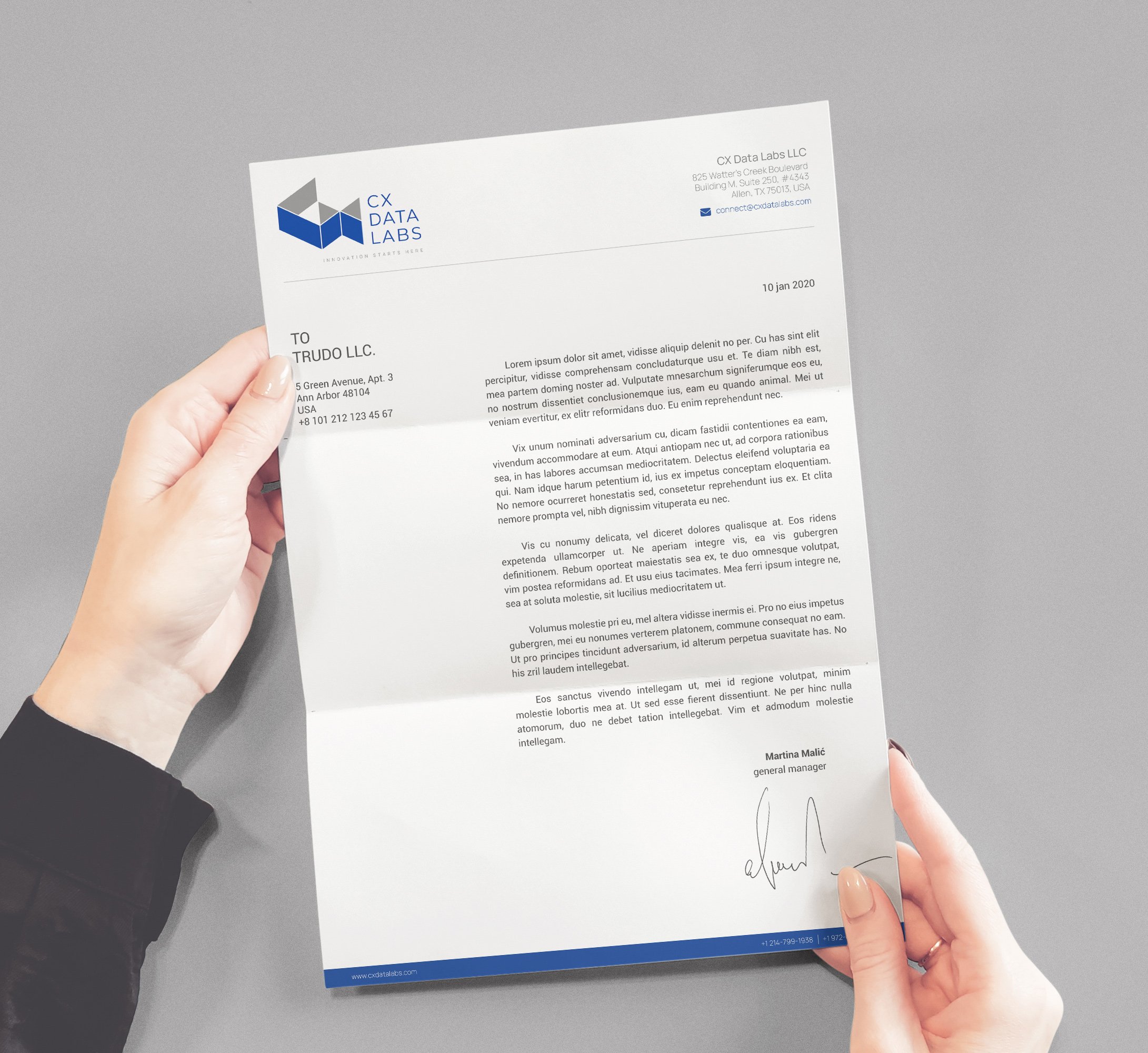
Brand stationery and assets design
Branded stationery and collateral go far beyond mere print materials—they are the physical embodiment of a technology brand’s DNA. In our approach, every stationery piece is meticulously crafted to serve as a powerful extension of the brand, reinforcing its core identity and values. By leveraging a carefully thought-out design language, we ensure that each asset—from corporate business cards and letterheads to envelopes and digital templates—communicates professionalism, trust, and a commitment to innovation at every touchpoint.
Exemplary Stationery Design: As illustrated in this analytics tech company branding case study of a USA based startup, each designed element is purpose-built to generate trust and clearly convey the brand’s values. This attention to detail ensures that every interaction, whether in print or digital form, leaves a lasting impression. The custom design elements are not just visually appealing but are strategically developed to foster brand recall and reinforce the sophisticated essence of a modern tech company.
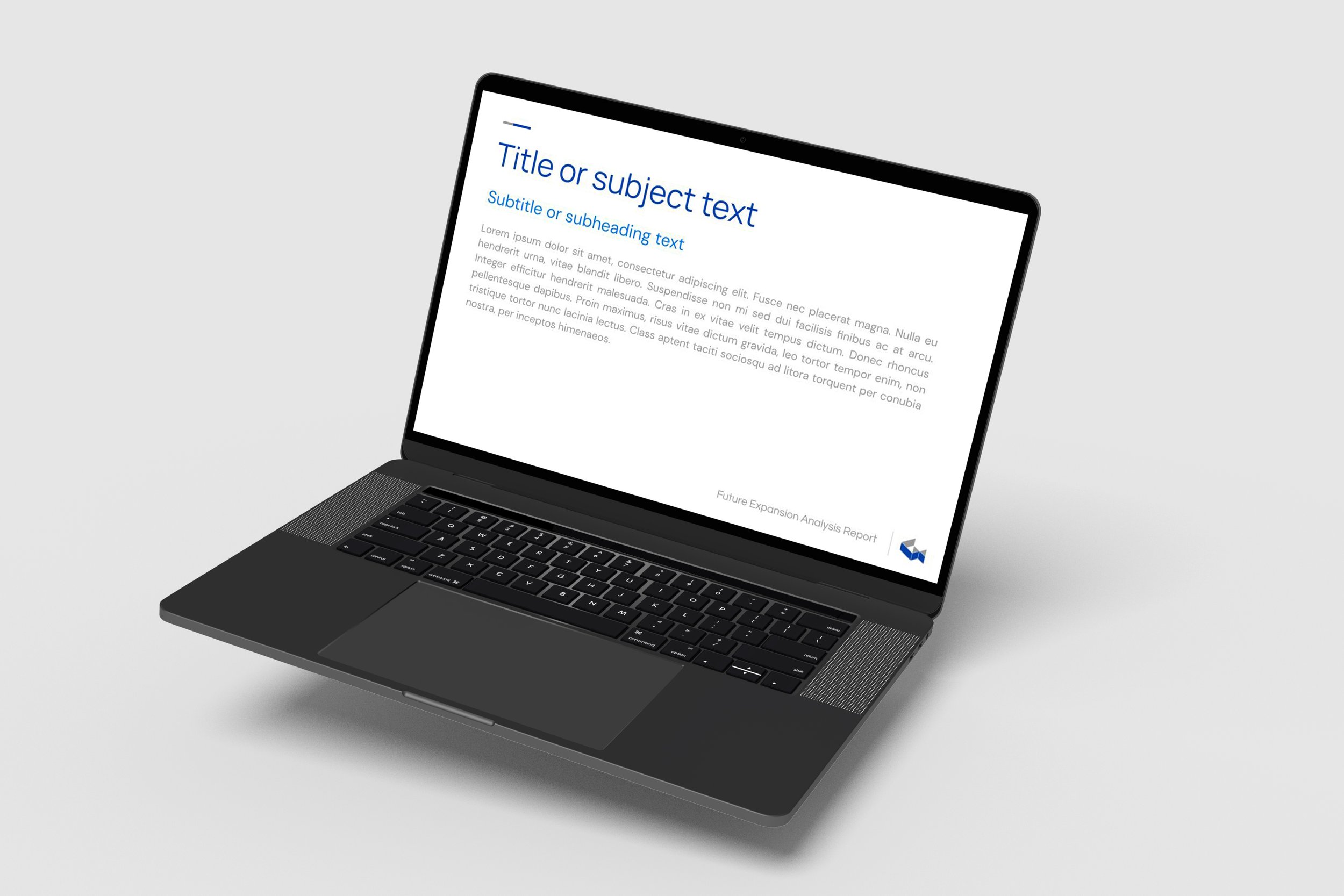
Cohesive Visual Assets: In addition to traditional stationery, our suite of brand assets includes a comprehensive range of digital collateral that complements the physical materials. Utilizing elements like consistent typography, a well-curated color palette, and innovative layout strategies, our visual identity remains cohesive across all channels. This unified approach enhances the brand’s credibility, helping it stand out in a competitive landscape while echoing the advanced technological ethos of the business.

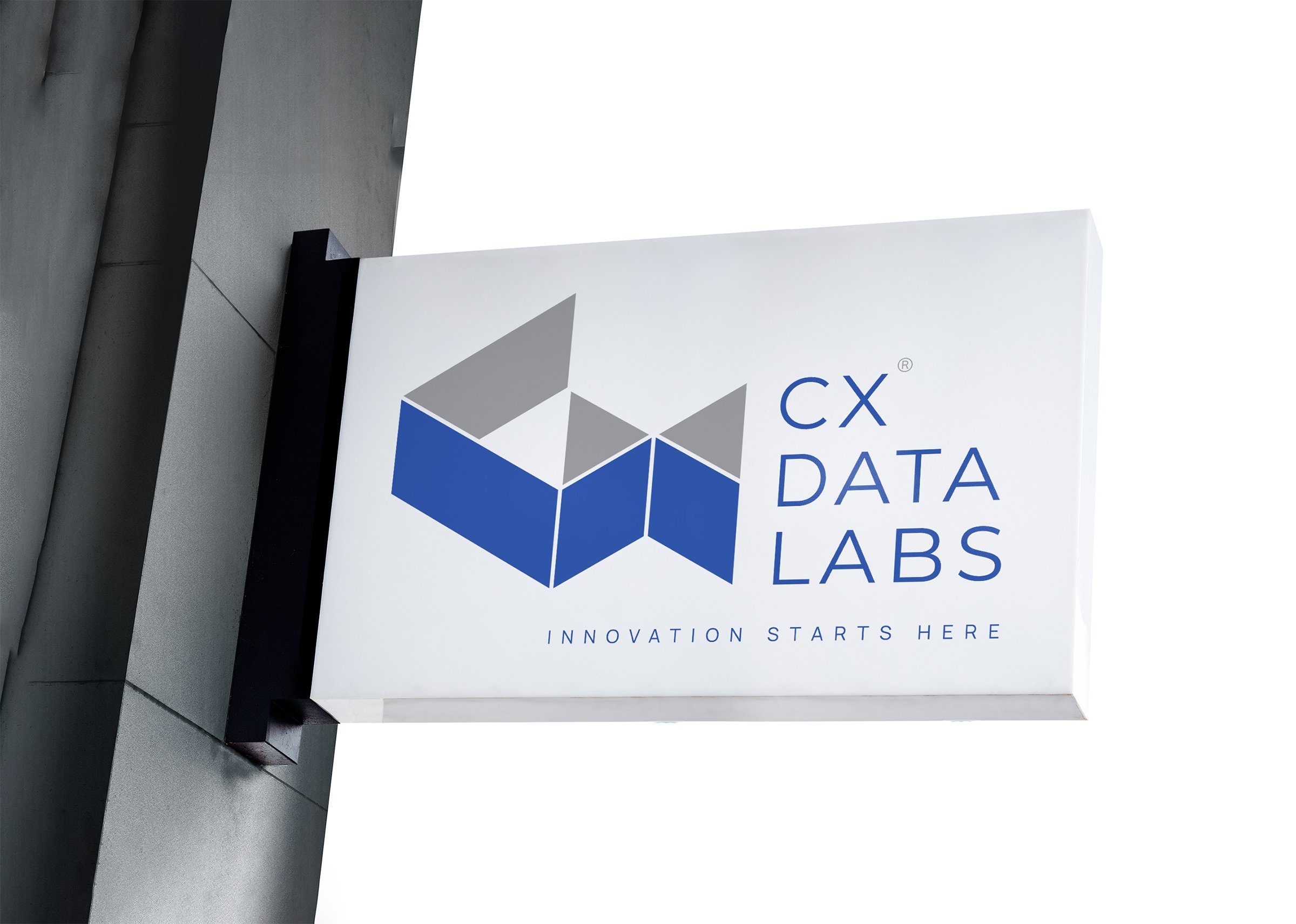
Brand signage design
In this section of our analytics tech company branding case study of a USA based startup, we delve into how our approach to brand signage design has played a pivotal role in fortifying the company’s visual communication strategy. Our signage design was conceived as a powerful tool to boost visibility and guide the right customers to the technology company’s office. In an era where digital and traditional advertising (such as radio, TV, and newspapers) can be either too broad or costly, our solution employs eye-catching design elements that serve dual purposes: wayfinding and brand reinforcement.
By integrating vibrant color schemes, bold typography, and dynamic iconography, we crafted a signage system that not only captures attention from afar but also echoes the brand’s core values of innovation, trust, and professionalism. Every element—from the layout and material quality to finish and placement—was carefully curated to ensure high visibility and lasting recall. This meticulous design execution transforms each signage piece into a mini brand ambassador, communicating the company’s distinguished identity at every customer touchpoint. The insight was that a well-executed signage design can significantly enhance both physical presence and customer loyalty. Ultimately, our approach demonstrates that strategic brand signage is not just about directing traffic—it’s about crafting a memorable and enduring experience that sets the foundation for long-term success.
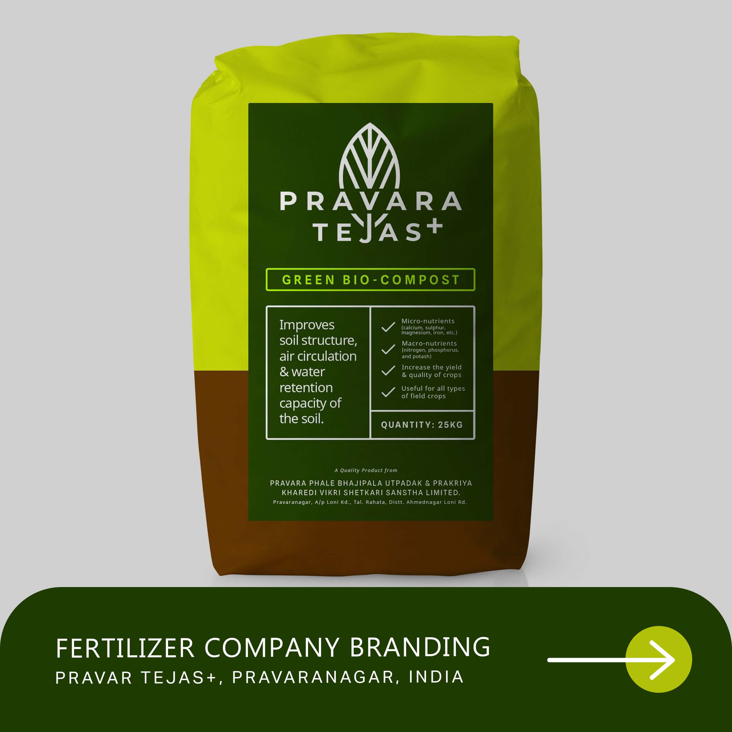
EXPLORE SOME OTHER WORK
Case studies of some other brands we’ve built.
Branding is at the core of everything we do. Every design, every detail, every decision — all purposefully crafted to strengthen the brand. Our outcome-focused solutions span research, strategy, creativity, engagement, and execution.