
BRAND IDENTITY / BRAND EXPRESSION SYSTEM / BRAND STATIONERY DESIGN / PRODUCT PACKAGING DESIGN / WEBSITE UX/UI / WEBSITE DEVELOPEMENT
Luxury clothing branding case study of a startup based in India
Project background: Despite the plethora of shopping options available, the founders of Arisa Atelier had identified a gap in the market. They perceived that existing options lacked decent quality clothing. Conversely, high-quality designer labels were often inaccessible to the middle class due to exorbitant prices and exploitation of handcrafting techniques. Arisa Atelier aims to bridge this gap by offering high-quality clothing at affordable prices, striking a balance between both ends of the spectrum. To realize this vision, the founder sisters, Indira Poosapati and Aswani Poosapati, approached Suruchi Trivedi to craft a brand that aligned with their company’s vision and mission.

Brand archetype : The creator
We recommended the ‘creator’ archetype as we plan to be dedicated to providing customers with the most up-to-date fashion trends. Creator attributes such as independence, honesty, curiosity, and excellent quality are also embedded in the brand’s principles.
The Creator brand archetype is all about innovation and creativity. These brands are typically non-conformists, becoming pioneers in new technology or creating unique combinations of features. Creators strive to create meaningful products with enduring value that align with their vision. They also empower their clients to express themselves freely, with the help of a tool, a new feature, or a design. Because of this, they naturally appeal to more creative or artistic consumers who place a lot of emphasis on self-expression.

Brand look & feel
The brand is Modern / Luxurious / Top Quality / Desirable
Brand Look: Minimal / Bold / Sophisticated
Brand Feel: Highly Professional / Exclusive / Premium
Brand Identity design
The brand logo unit is an iconic design that reflects luxury, style, and exclusivity, making it a significant aspect of the luxury clothing branding case study of a startup based in India. It is made up of two parts, with both of them complete in themselves to be used in a stand-alone manner. The first part is the brand symbol, made using a fundamental shape - a square. The other part is the wordmark that has been developed using custom-crafted typefaces, designed from scratch specifically for the brand.
Both the words in the brand name ‘Arisa’ & ‘Atelier’ have been given equal weightage so that the complete brand name gets popular in people’s minds. This is also done because the full brand name makes complete sense. ‘Arisa Atelier’ has been written in continuation (ArisaAtelier) without keeping any space between the two words so that the logo appears like a single visual unit. By having both the initial letters of ‘Arisa’ & ‘Atelier’ in upper case (capital As), we have made the two words appear visually distinct despite writing them together. The uniform stroke thickness across the logo makes it coherent and displays the company’s ideologies. The fundamental block (square) used in the symbol is also equivalent to the stroke of the typefaces, making the unit a single visual family.
The custom typeface family of the brand identity can be extended to include all alphabets and numerics for application in all brand communication in the future.
-
The typeface architecture of the logo and the brand symbol is designed to appeal to both the genders. The curves of the typefaces have been carefully crafted to get a balance between feminine and masculine connotations. Square being a unisex shape, has been chosen as the fundamental shape of the brand.
-
The logo and the brand symbol have been designed to go well with Indian-style garments and western outfits.
-
The finely defined construct of the logo creates a luxurious appeal and helps the brand logo stand out and appear aesthetic in all sizes.
-
An overall minimal look of the brand is maintained through the identity design. The feel is kept modern and sophisticated. The curves and styles are kept elegant and bold.
Color palette for luxurious branding
The brand colour palette and the colour combinations have been recommended keeping in mind the emotions we want the brand to evoke and that the brand should appear unisex at all times. As highlighted in this luxury clothing branding case study of a startup based in India, we recommended black to be the primary color of the brand. The color black is unisex, bold, elegant, modern, and luxurious. It brings out our brand personality in the best manner. For branding at key touch points, we recommended that the brand should try to use a white-on-black background color combination (as showcased in the example above). It was also the primary color combination recommended for the brand. For ethnic and Indian collections (such as wedding/festive wear) or branding on Indian occasions, we recommended using the green+light golden combination as it goes well with the cultural values of Indians, across religions.

The significance of the colors used in the palette is explained below :
Black: Black symbolizes power and elegance. It stands for minimalism and is a sign of luxury.
Dark Green: Green brings a sense of visual balance and harmony, projecting a soothing feeling of relaxation and safety. The color projects a calm, trustworthy optimism.
Brown: The warmth of brown is associated with reliability, healing, and strength. The colour is considered all-natural and earthy.
Light Golden: Gold is the color of wealth and luxury. It also signifies wisdom and magic.
White: White is the lightest color, meaning purity, innocence, perfection and integrity. White is impartial, independent and neutral towards everything.


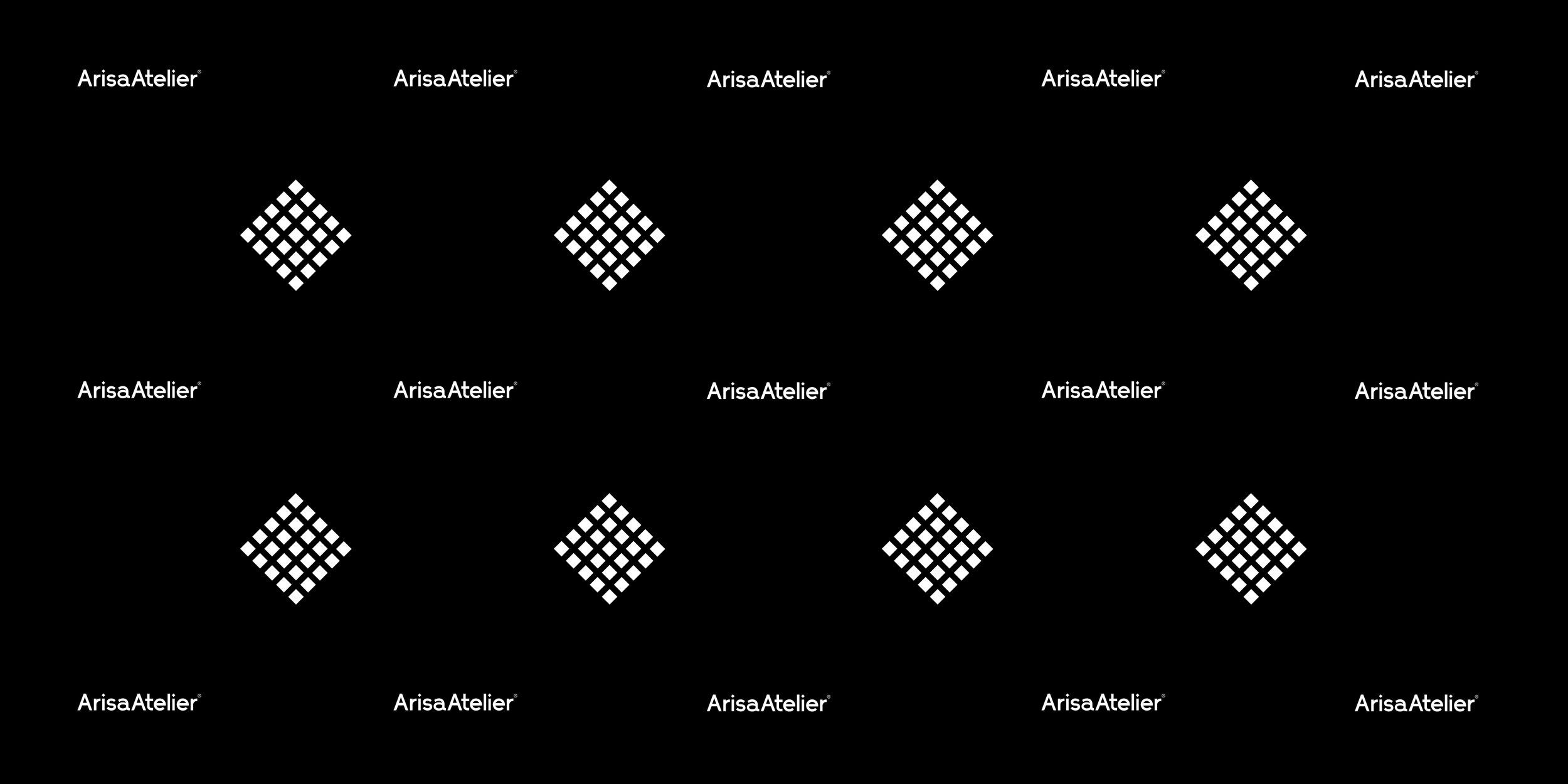
The story behind brand icon design
The creation of the brand icon represents a harmonious blend of traditional craftsmanship and contemporary design. Crafted from meticulously arranged equidistant 5x5 square patterns, the icon reinterprets the classic square—a symbol of balance and stability—with a fresh, modern twist. Its design not only draws immediate attention but also conveys an authentic and iconic brand appeal.
This innovative mark tells a dual story. The repeated square pattern subtly mirrors the fine texture of luxurious fabric at a micro level, while its precise geometry evokes the brilliance of a diamond—an allegory to the superior quality embedded in every garment design. In fact, this intricate fusion of elements is a hallmark highlighted in our detailed luxury clothing branding case study of an India based startup company, where the essence of quality and innovation was paramount.
Engineered for versatility, the brand icon is designed to be just as effective when used independently on smaller items—such as buttons, zips, or embroidery—as it is when part of larger brand communications. Its simplicity, composed solely of essential geometric forms, ensures that it remains production-friendly across various applications like embroidery and die-punch techniques. Ultimately, this distinctive brand icon is more than just a visual mark; it is a narrative of quality, authenticity, and timeless luxury that elevates the entire brand identity.


Brand logo morphology
The morphology of our logo gives it a unique personality. Its characteristics serve as the basis for our graphic system and are replicated in other assets to give coherence to the entire system.
Brand typography family
The below typography system has been chosen in line with our logo morphology. The font for the heading is Manrope. It is recommended as it looks good in large formats and all sizes. The body font, Nato Sans, has been chosen to work in small spaces and smaller sizes. The alternate font, Arimo, has been recommended to be strategically used at places to break the design monotony. All the fonts have been chosen to maintain the overall brand look and uniformity in style at each touch point.


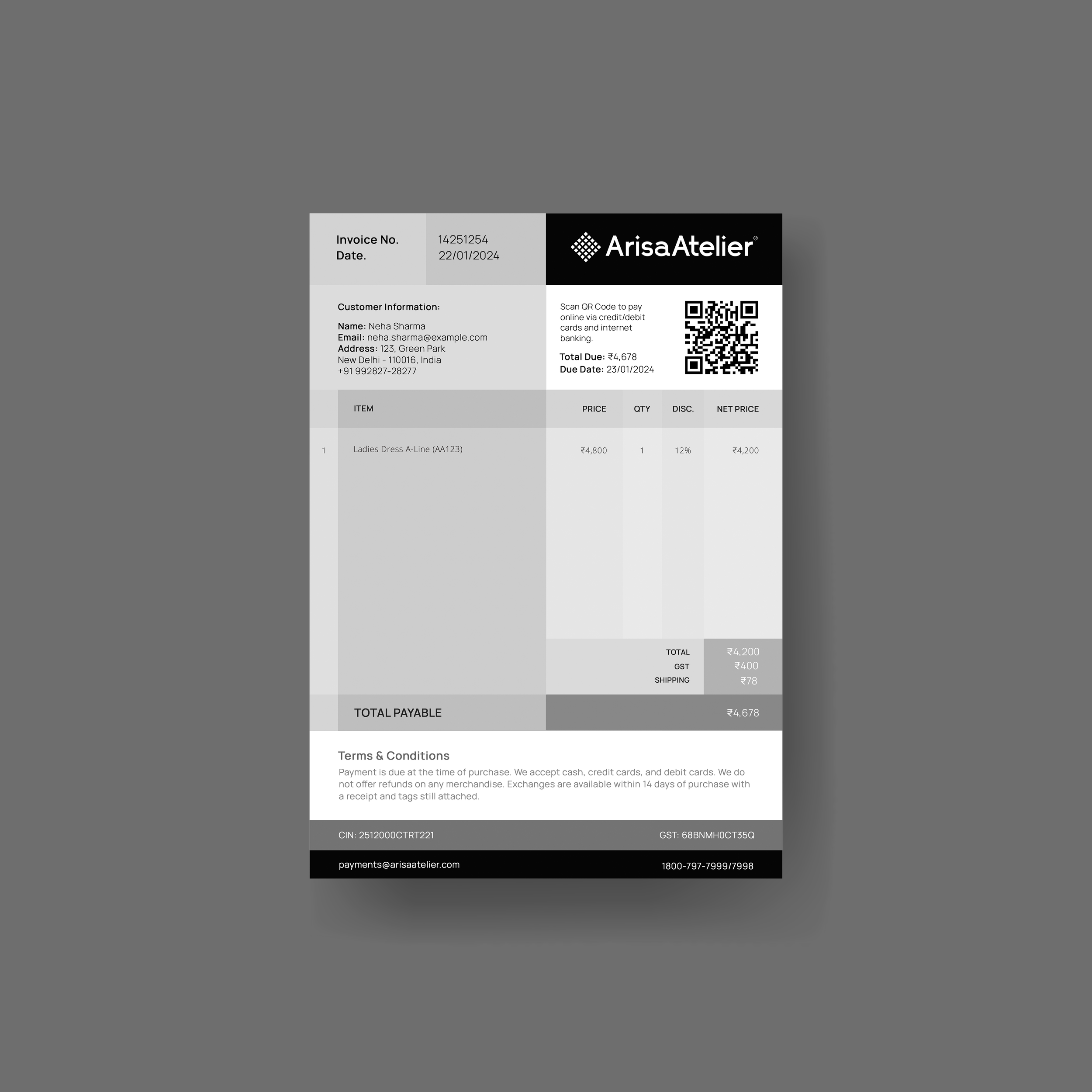
Brand stationery design for cohesive branding
The brand stationery for Arisa Atelier is a seamless extension of its sophisticated identity, ensuring every touchpoint reflects luxury, style, and exclusivity. This meticulous attention to detail serves as an integral element of the luxury clothing branding case study of a startup based in India. Designed with precision, each stationery element—from business cards and letterheads to envelopes and notepads—incorporates the brand’s distinctive logo unit, reinforcing its iconic presence. The custom-crafted typeface, developed exclusively for Arisa Atelier, is elegantly applied across all stationery, maintaining a cohesive and premium aesthetic.


Packaging design strategy
The packaging design strategy focused on creating a premium and sophisticated look by incorporating a defined geometric shape, opting for rigid materials like cardboard instead of flimsy pouches. A rectangular or square box was recommended for easy stacking and storage, or a unique geometric form to enhance brand identity. To maintain an elegant and cohesive brand image, subtle branding was prioritized, with a minimalist design featuring a refined pattern and a discreetly placed logo. Sustainability was also a key consideration, with a focus on using eco-friendly materials like recycled cardboard or biodegradable plastic, aiming for a 70-80% eco-friendly material ratio. Minimal text usage helped achieve a clean and modern aesthetic, emphasizing visual impact through high-quality materials and subtle branding elements, while essential details were included on inserts like a ‘thank you’ card or side labels. Additionally, the packaging was designed to be easy to manufacture, cost-effective, and simple to assemble, ensuring efficiency in the packing process.


Brand store facade design
The brand store’s look was recommended to be minimal, modern and iconic, in line with the overall brand image. We recommended using backlit branding on black surfaces or bold white branding on glass facades. The brand symbol was recommended to be used in large formats to strengthen the brand’s visual identity system.

Website UX Design
In terms of UX design, our goal was to create a seamless and enjoyable shopping experience for customers. We prioritized ease of navigation and a user-friendly layout, ensuring that customers could quickly find the information they need and complete their purchase with minimal effort. By incorporating user feedback and testing our design iteratively, our aim was to create a product page that not only meets but exceeds customer expectations.


E-commerce website UI design & development on Shopify
Our UI design focused on creating a visually captivating and intuitive interface. The aim was to showcase the product in a way that highlights its unique features and benefits. By using a clean and modern design, we ensured that the user's attention is drawn to the product itself, making the shopping experience engaging and memorable.


